Monday, 28 November 2011

Sticky Note 18: Prosopa Restaurant

Prosopa is a quirky industrial style restaurant located in Rouf, a hotspot in Athens, Greece. Rouf is a central hub for cafes, restaurants, music, clubs and the new Benaki Museum which makes Prosopa fit in seamlessly into this dynamic precinct.


Photography by Vangelis Paterakis

This little restaurant beside the train tracks on the outskirts of Gazi has plenty of atmosphere going for it in this once-forgotten section of the city. Situated opposite the train tracks in a former glass factory which was converted into the restaurant by 360id studio, the design for ‘Prosopa’ was inspired by the ‘faces’ (Prosopa – in Greek) of its potential clients. Interior designer Alexandros Tsikordanos’ 360id studio sought a rather artistic/industrial interior design scheme; the graphic design on the walls reading: under construction, and the ‘restaurant’ circuit links creates a similar link between the interior/exterior of the restaurant as with the customers and the service.

Photography by Vangelis Paterakis

Photography by Vangelis Paterakis

Both façades of the old-glass factory have been left relatively untouched, and have only undergone a face-lift. The industrial character of the façade has been transferred into the interior through the 360id studio's design approach. With uninterrupted views through the industrial windows to the interior, and a clean, contemporary industrial design the visitor is prepared for what he/she is about to see and experience. The former glass factory is now a contemporary space which unfolds onto two levels, where industrial style amalgamates with new design trends.

Photography by Vangelis Paterakis

Photography by Vangelis Paterakis

Photography by Vangelis Paterakis

Photography by Vangelis Paterakis

Photography by Vangelis Paterakis

Photography by Vangelis Paterakis

Materials such as steel, screed cement flooring, wood and bricks add up to the overall industrial feel. The double-height spaces, the revealed air ducts and vents and the timber roof, all make references to the former glass factory. The interior program is divided into two double-height spaces, linked by a corridor where the bar, which is the heart of the restaurant, is positioned in the main space. While customers enjoy their food, they are able to enjoy views of the suburban train tracks and the fast trains passing by. 

Photography by Vangelis Paterakis

The second space is the rear of the restaurant with views of St. Basil church. The two spaces are linked by a corridor with exposed brickwork, on the opposite wall of the corridor, the wall paper reads: ''The way you cut your meat reflects the way that you live'' by Confucius.  The restaurant’s overall design scheme is harmoniously balanced, and this has a lot to do with the choice of colors used in the interior – a lot of achromatic tones have been applied as well as materials which create a Zen feel. A selection of furniture by Magis and Moooi light fixtures blend in subtly with the industrial elements.

Photography by Vangelis Paterakis

Photography by Vangelis Paterakis

In essence, this rustic take on an industrial setting works for this restaurant. I personally love the introduction of the graphics. For me, they link back to the nearby train station forming simple railway lines along the wall with the inclusion of the 'stops' relating back to food. 
Clever, I say!

Information about this project has been sourced from Yatzer. They have a great design website which I recommend taking a look at:


What do you think? Would you dine there? I would love to know your thoughts so feel free to leave your comments below.

Saturday, 10 September 2011

Little Yellow Sticky Note Survey


Little Yellow Sticky Note is in the process of developing a new furniture collection and we need your help.....

We have put together a survey that will only take a few minutes of your time. We would love for you to be apart of the development of our new collection and this is how you can!

Please click on the link above to be directed to the survey, all responses are completely confidential.

Thank you and please let me know if you have any questions!


It's A Wrap // Saturday Indesign Sydney


Well it's a wrap! Satruday Indesign is done and dusted for another year.What an event it was, right? Huge! For those of you reading this and have no clue as to what I am talking about, I am referring to the annual design event that is hosted alternately in Melbourne and Sydney. Think Milan Furniture Fair on a much smaller scale. 

This year it was held in Sydney. The city buzzed with the bright orange dots signalling a SiD participant, the courtesy buses were zooming around the 36 locations that spanned across five precincts and we had only nine hours to see everything....yes, only nine hours!

Whilst I didn't get to see all of the locations I did manage to fit in my favourite companies, here is a snap shot...

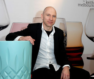
Zenith's Thursday night VIP party. This was a great start to the Saturday Indesign adventure. 'The highlight' I hear you all ask? Meeting Keith Melbourne the designer of the exquisitely designed 'Glass' collection.

Chatting with Keith Melbourne

The wonderful Belinda from Zenith Brisbane

'Glass' by Keith Melbourne

Keith Melbourne

'Glass' by Keith Melbourne

I woke to a beautiful Saturday morning, perfect SiD weather. Corporate Culture was the first stop as I was keen to check out the launch of their 'About A Chair' by Hee Welling for Hay. 

Also pictured are my favourite lights, Caravaggio for Lighyears.


Favn by Jaime Hayon


These chairs are stunning and comfortable. Definitely on my wish list!

It was then over to Stylecraft....


A big 'Thank you' to Natalie in the Brisbane showroom for sending me a very handy Wallpaper Guide to Sydney....


Then finishing up at Jardan, one of my favourite showrooms....


To sum up, an amazing day with amazing products and amazing people. Already, planning a trip to Melbourne for next years Saturday Indesign.


Sunday, 17 July 2011

ForDesignFor // ForDesert Chaise Longue

As a designer, working towards sustainable environments is always at the forefront of every design decision. Using recycled materials is just one method that many companies are using to create truly sustainable products.

Photographer: SERENA RICCARDI

ForDesignFor is a company devoted to the war on wastefulness. 
FordesignFor was born in Milan in May 2007 , thanks to the ideas of young designer Luca Gnizio, who proposes a personal vision of design through his projects. FordesignFor appeared on the international design scene, focusing resources and ideas in favour of an eco-sustainable project.
Thanks to the constant search for captivating shapes and innovative materials inspired by a contemporary vision of lifestyles, FordesignFor 
presents creative combinations where ingredients and contaminations from both the natural world and the urban scene come together in a representation of contemporary society and its constant mutations.

Photographer: SERENA RICCARDI

FordesignFor 
seeks to use recycled materials from various industrial sectors and employs energy from renewable sources, the idea being that of transforming what are commonly viewed as waste products into useful objects of beauty, giving them their rightful place in daily life and showing that using recycled materials by no means implies products of a lower quality, but rather winning, quality products which carry with them principles of responsibility for the protection of the environment.

Photographer: SERENA RICCARDI


FordesignFor works in close cooperation with a number of industries for the supply of waste materials and is actively involved with social cooperatives for the production of some parts of its projects. In this wayFordesignFor aims to achieve a modus operandi where contributions on social and environmental levels come together to create a team of players in the creative process. In the eyes of FordesignFor, sustainable development is only possible by following the principles of cooperating and sharing, thus arriving at an approach which is a completely different way in which to relate to the market and the consumer.
FordesignFor sprang from the creative mind and determination of Luca Gnizio. 

Photographer: SERENA RICCARDI


Photographer: SERENA RICCARDI

There are more than 300-million scrap tyres in the US alone. The ForDesignFor company is speaking out against wastefulness and negative global change, namely the widespread desertification that is wringing out our world of its water supplies. Their ForDesert Chaise Longue is made using post-consumer recycled materials such as nylon tyre cord fabric and strips of iron salvaged from construction sites. This tangled creation mimics the colour and movement of desert sands.

This is an incredibly unique and sculptural piece that has given back to the environment. Please take a look at ForDesignFor websites as there are many other products they have developed using 100% recycled content.


Sunday, 10 July 2011

Little Yellow Sticky Note At Home...Blown Glass Pendants

The long awaited 'Little Yellow Sticky Note At Home' has arrived!

To kick things off we look to a design icon for some wise words:

"fashion is not something that exists in dresses only... fashion has to do with ideas, the way we live, what is happening" Coco Chanel

It's even in home and commercial furniture and fittings.

Now, I know you are all wondering what it is that this new section of the Little Yellow Sticky Note has to offer you....I'm glad you asked! This section has come about from many viewers asking if I can post design idea's and trends for the home. As I have a more commercial bent towards interiors the products and idea's that are exhibited on this page can be used for both home decoration and commercial interiors....so the best of both worlds!

I have always been a huge fan of blown glass. I just love the delicate forms that can be created with this beautiful material. Hanna Kruger from Germany has designed Vaiss.eau which embodies this delicate form of blown glass.

photos © Minu Lee

The pendant light VAISS.EAU is inspired by the forms of historical glasbottles and bowls. The design of this mouth-blown, double-walled transparent glass body is concerning the relationship of traditional manual methods of production and the design of contemporary products.

photos © Minu Lee

 It is an attempt to re-imagine the functions of commonplace items. The lamps particular exterior form and especially the inward curvature at the bottom resemble the shape of historical glasbottles. In the manual production the curvature has production-related as well as user-determined reasons. Some of these aspects will be re-interpreted and for this purpose, will be functionally and aesthetically raised up in a new context.

photos © Minu Lee

 The body of the lamp combines lampshade, reflector and light space in a unique form. The curvature serves as entry for the illuminate and at the same time as reflector. The cable is led upwards through the hollow space of the glass body. The interior volume of the light offers enough space to incorporate the windings of the cable, which become elements of design. Depending on the height of the hanging assembly more or less cable is curling in the inner space of the lamp. 

photos © Minu Lee

Through the transparent surface and the visible technical components as the cable and the hanging, the object is changing between lamp and technical glass gadget. As soon as the object is filled with light, a vitreous light container seems to arise: a luminous vessel.

photos © Minu Lee

These gorgeous pendants could be used residentially (I initially thought over bedside tables) or commercially (lounge or reception areas). I personally love the blue pendants, what is your favourite colour?

Check out http://www.wird-etwas.de for more of Hanna's work.

I hope you enjoy this new section and please let me know if you come across any amazing ideas that you would like to see on the Little Yellow Sticky Note.

Have a lovely week!


Monday, 4 July 2011

Sticky Note 17: House T

I have always been fascinated with micro spatial planning and design. I just love the micro hotels that are now popping up in airports all around the world and I especially love micro planning in a residential setting. I was fortunate enough to come across House T which is located in Torino, Italy. This house is a wonderful example of micro design....and I love the pop of colour!

Photography by Enrico Muraro

This house has no conventional limits. There are surprises around every corner and now considering the space is very small that is a challenge in itself.

Photography by Enrico Muraro

Photography by Enrico Muraro

The large white box in the centre of the room is what this space revolves around. This element acts to divide the room into two whilst performing different functions for the same space. In the image above, the white box serves the living room space with entertainment storage.

Photography by Enrico Muraro

Photography by Enrico Muraro

Now the dual function of the box element becomes apparent. A fold out bed is cleverly hidden within the element that creates a bedroom space.

Photography by Enrico Muraro

A big 'Thank You' to UAU for allowing me to blog about their project.
Please check out their website as they have plenty of amazing jobs!


Please feel free to leave any comments as I always enjoy hearing from you!

Have a lovely week!