Tuesday 31 May 2011

Sticky Note 13: Next Door by Studio Quint


Nextdoor is a temporary interior design by The University of Amsterdam, for the Center of Amsterdam School of Entrepreneurship (CASE). Following a new educational approach students with concentration on different fields of study are provided by the university to become young entrepreneurs and develop a business concept and market strategy with the support and assistance of the university. Basically, CASE acts as an angel fund, (what is known as a venture capital) by providing the young entrepreneurs with the space!


A total area of 275 square meters was provided as office space by the university, but the renovation of the area was on a tight budget. Studioquint and Jos Roodbol put their forces together to keep the project on a low budget and design 10 permanent work-units and 40 flexible work areas.


Being on a tight budget, all the furniture and work units have been assembled by low cost standard door-elements. Furthermore, the plaster board ceiling was removed but the structure was kept intact, giving a view of the exposed building structure, the wiring, and the air vents. The specific programmatic conditions acted as the starting point to the spatial intervention of the area. These factors were no other than the student; as every young entrepreneur has to develop their own business identity and at the same time all of them have to adjust to the complex economical network.


The composition of the working units are white cubes and the differentiation has been achieved by the addition of various interior design elements which are made by black plywood. The black plywood elements are necessary as they provide storage spaces and stabilize the units as they introduce a new layer of scale. The orientation of the work stations is placed in a long-drawn linear order, while the black plywood storage element appears to create a visual pattern and spatial zoning, seeming as if the other office is right //NEXTDOOR//.


Information about this project has been sourced from Yatzer. They have a great design website which I recommend taking a look at:

http://www.yatzer.com

Photography by Mark Weeman

Personally, what I love about this space is that it takes a different approach to office design that I am yet to see within workplace design projects in Brisbane. It seamlessly combines the traditional office space with a collaborative open plan set up. This approach integrates an element of activity based workplace design with conventional office layout methods.

The expressed edge to the workstations is a simple detail that, within this space, works so effectively at expressing the geometry of the cubes. This detail combined with the striking colour scheme and materials selection make this one innovative design! It's hard to believe it was accomplished on such a tight budget.

A big 'thank you' to Studio Quint for allowing me to blog about Next Door. Please check out their website to view more of their amazing work:

http://www.studioquint.com/

What do you think? Feel free to comment below! 


Saturday 28 May 2011

Little Yellow Sticky Note Loves...Aplomb by Foscarini


When I was presented with Aplomb by Foscarini I was puzzled and intrigued by the idea of a concrete pendant light. I loved the concept and was delighted when I was sent this video to see how it is made. It's pretty amazing...


Aplomb is essentially a small hanging lamp in concrete offered in three, coloured finishes which celebrate its personality, bringing together different styles, from the traditional grey of cement in its raw state, which adds depth to the volumes, to a stylish white hue, and a warm intense brown.


This is a photograph sourced from The Cool Hunter website. This is an office fitout for Azure in the Ukraine showcasing this beautiful light. For more information on this project: http://www.thecoolhunter.com.au

In Australia, Aplomb can be purchased through the wonderful team at Space. Click on their logo to be taken directly to their website:


If you are outside of Australia, you can contact Foscarini for outlet information.


Thursday 26 May 2011

Sticky Note 11: Beauty Emporium

Every girl loves the idea of a Beauty Emporium, right? Well, I just know that you are going to love this project by Singapore based design firm, Formwerkz. The brief was to design a space for the client, Spa Espirit Group, that became the worlds first one stop shop for beauty and nutritional needs. A place where you can pick up a massage, fascial, manicure, Brazillian wax or brow du jour, a book, a shooter and the latest album release from Nouvelle Vague.

Formwerkz have used the strategy 'Reduce - Recycle - Reuse' as they transformed the existing spa premise with minimal wastage and cost.


As you can see from these amazing images, it's not surprising that the Beauty Emporium received an honourable mention at the 10th 2010 Singapore Institute Architectural Awards.

Now a little bit about the philosophy behind Formwerkz:

We have no interest for architecture that is preoccupied with it's obsessive pursuit of minimal refinement as an end. 

Rather, we want our efforts to be directed towards the recovery of mutual human relationships, and the restoration of primordial relationships between man and nature.

We are keen to design happenings or more precisely, conditions that can espouse more active engagement from man with his environment.  


Please feel free to make comments as I would love to hear your thoughts!


Tuesday 24 May 2011

Sticky Note 10: Wood Infused Apartment

Cultural habits, climatic conditions and a call for pragmatics come together in a wood-infused apartment.


I just love this Singapore apartment by the brilliant designers at Studio SKLIM. Thought and care has gone into the impeccable detailing of all of the timber veneer joinery and it is just devine! 

Thank you to Studio SKLIM for allowing me to blog about Red Hill Apartment. Please check out there website, they have completed amazing projects!


Public housing has come a long way in Singapore providing the needs for 80-90% of the population. The perception of public housing in the world is perhaps not of the best, but in Singapore, the quality and standards of these apartments well rest above the poverty line, driving prices rocket high.
The client had just returned from a three-year long diplomatic stint and was looking to refurbish his apartment to welcome his new addition to the family.
Pragmatics was the primary driving force of this project. The main challenge was to reconfigure a public housing apartment amidst the regulatory constraints into an object of spatial flow. The present main foyer/dining/living/kitchen space was segmented with proportions that were not user friendly. The foyer area and the kitchen entrance were too generous and encroached upon the dining room. The Asian lifestyle with regards to cooking, culture (eg. Feng Shui) and climate were duly considered as design challenges.


After a study of the existing structure, we removed one of the non-load bearing walls and reconfigured the rest of the surrounding spaces. The concept was simple: to create a large space with distributed furniture and a mirrored surface to reflect the surrounding spaces. The kitchen was subdivided into a wet and dry area with part of the latter extending to become a foyer cabinet. The dining space became larger and visual continuity was achieved with all the surrounding built-in furniture; from the foyer to the dry kitchen to the living room set. It became a set of separate furniture pieces for one big space!


The design approach to the individual furniture pieces were derived from their inherent functions and their relationship to each other in that particular space. For example, the slope of the entrance foyer piece was a reflection of the inclined shoe rack enclosed in the bottom cabinet. In hot and humid Singapore, residents prefer to keep the main doors open to encourage natural ventilation. The gap between the top and bottom pieces facilitated this cross ventilation and gave a sense of semi-privacy to the apartment.


The furniture pieces were designed as a set and related to the bigger spatial flow with geometry and material continuity. The large wooden grain textures that clothed the furniture took a further inspiration from the Miesian aesthetics of the Tugendhat House but redone for this modern context.
The Redhill Apartment was an attempt to provide an insertion of nuanced living infused with cultural habits, climatic conditions and a call for pragmatics in an otherwise generic housing estate.

'Like everything else in the house, it displays a sensitivity to the subtleties of everyday living'

Words : Studio SKLIM
Photography: Jeremy San

Amazing huh? I thought you would think so! Please feel free to leave comments, I always enjoying hearing from you.


Saturday 21 May 2011

Little Yellow Sticky Note Loves...Studioprototype Architects


Back after popular demand, 'Little Yellow Sticky Note Loves...'!!!
For this second instalment I have roamed the globe in search of a source of design inspiration. I found it in the way of  adventurous architectural firm, Studioprototype Architects, located in Greece.

Studioprototype is a Greek and English speaking architectural design practice based in Greece. It is run by partners Sofia Limpari and Neal Shah.

Studioprototype carefully evolve their designs closely with their clients to produce intelligent architectural design solutions of high quality in a bespoke, adventurous and responsive manner. They specialise in one off private residences, private residential housing, commercial and retail environments and the renovation and conservation of historic and traditional buildings throughout Greece.

I knew Studioprototype was special when a restaurant / bar in Greece caught my eye. Take a look...

Click the images if you would like to see a larger view


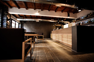
Located in a traditional mountain village in Northern Greece, this restaurant and bar interior celebrates the elemental simplicity of natural materials. The subtle tones of stained oak timbers and light travertine surfaces juxtaposes against untreated decorative iron work and dark furniture and fittings. The result is a contemporary aesthetic set within a traditional vernacular environment. 

Now, I can not just leave you with one project. Studioprototype have also completed a rustic style bakery called Elektra located in Edessa, Greece.


This shop is part of a chain of family-run bakeries called 'Elektra' located in Edessa, Greece. Studioprototype had the opportunity to redefine the look of its shops with this pilot project. The shop is small covering only thirty-five square metres and occupies a strategic corner plot on the main pedestrian high street.

Working with a narrow, linear floor plan a rigorous language was developed for the shop based on a long marble food counter acting as a monolithic focal point of the spatial arrangement. Light and luminosity flood the interior of the bakery accentuating the food items on display like gold. Exquisite materials such as Carrara marble, wood and brass serve as the backdrop for all food products instilling the rustic and artisan aspect of making bread. A sense of craftsmanship is imbued with the exterior of the shop being entirely clad in cedar like a well tailored suit. Punctuating the cedar cladding on the long facade, a black powder coated steel window box projects outwards to serve as a seating area and bar for customers inside and outside the shop.

A big 'Thank You' to Studioprototype for allowing me to blog about their projects. Please check out their website:

Please feel free to make comments as I would love to know your thoughts.

Leila


Friday 20 May 2011

Sticky Note 09: Fairwood Buddies Cafe

Fairwood Buddies Cafe is a wonderful restaurant design located in Hong Kong. The designers, Beige Design, have brilliantly combined geometric form and repetition in various materials to deliver a simplistic yet complicated interior. Pay close attention to the finer details as this project is a stunning example of joinery detailing at it's very best! 

Click on the image if you would like to see a larger view.


Fast food restaurant design was no challenge for Hong Kong-based designer Danny Chan, the former chief interior designer of Steve Leung Designers Ltd., and John Chan Design Ltd. Danny Chan has contributed to the trendy and fashionable re-branding of Maxim's Fast Food and designed many outlets in the Fairwood franchise; today, Chan is the director to his own entrepreneurial quest, Beige Design. Commissioned to design a branch of the Fairwood Buddies Café in the Citygate mall in Tong Chong, conveniently located at the end of the ‘fast track’, the fast food restaurant takes a refreshing scoop of design and an interesting approach where the space is filled up with geometric hexagonal shapes!


Beige Design was inspired and approached the interior, drawn by an oversized hexagonal column in the floor plan; the flimsy yet elegant design sparked off with a geometric recurrence within the space like a hexagonal chemical bond which is formed in chemistry. Taking a two-dimensional concept, the geometric form develops it into a three-dimensional interior architectural perspective with innovations and explorations; in a space totaling 180 square meters and without any view, this interior design approach defines the ultimate coherence possibility.


The hexagons bring about a coherent bonding portraying the ideal match between the central theme of the space – ‘buddies.’ The concept was that the hexagonal shapes take the shape of the space throughout. The original oversized hexagonal column is covered with mirrors to multiply the effect of the figure; this conveniently allows the oversized column to disappear into the space. A Corian® hexagonal counter stands in front of the column; custom-designed pendant lights feature bare bulbs encased in hexagonal wire casing.


The guests have the opportunity to peek through an attractive window into the cafeteria-style kitchen's roast meat area as there is a mirrored cutout at all the booths. The spotlights divulge hundreds of the shape hidden in the three-layer staggered walnut veneer wall panels. The flexible arrangement with the tables, allows the ‘feature’ hexagonal tabletops, to be pushed together and form a honeycomb shape to accommodate larger groups turning out to a pattern and the theme – for flexible ‘buddy’ socializing! Carefully arranged flooring, and custom-made furniture and fixtures add to the overall design scheme. Subtle lines divide the ceiling blocks for once more into hexagonal zones. In a harmonious tone, the walnut color is offset by the pure white to form a clean and natural backdrop to stage the customers.


However, Chan has decided to keep everything mostly white and stay away from the Fairwood corporate identity color – orange, which dominates the other cafés. The truth is that it is difficult to draw away from the identity colour, as this may affect the company. However, this dedicated design approach shows the ultimate fragility a design can offer; the influence of this design language system can be revealed from the point where it starts. With its own design language, this fast food restaurant reveals the possible ultimate intimacy in an interior architectural design.


Location: Tong Chong, Hong Kong
Owner: Fairwood Holdings Ltd.
Interior Design Firm: Beige Design Ltd
Interior Design Project Team: Danny S. Y. Chan
Contractor and Engineering: Alliance Engineering Co. Ltd
Date Completed: June 1, 2009
Photographer: Ulso Tsang

Information about this project and photographs have been sourced from Yatzer. They have a great website which I recommend taking a look at:

I hope everyone has a great weekend!

Leila