Thursday, 9 May 2013

Sticky Note 22: Youth Republic


Well I am super excited to be sharing this post with you all. 'Youth Republic' is one of those projects that suddenly appeared on my desk and blew me away. It had me thinking, 'damn I wish I had of been apart of the team that created that whole lot of goodness!'.

Luckily I get the privilege to blog about this amazing project by the incredible Turkish design studio, Kontra Architecture. Here is a little bit about Kontra Architecture:

Kontra is an environment think tank where space and ideas are audited, researched, analysed, created and revolutionized.

Kontra believes that architecture define's one's world view and is an interdisciplinary language between all art departments.

At Kontra, it is important to be the pioneer of unconventional success, and go beyond the unattempted
for an extraordinary realisation.

 With that bit of inspiration in mind there is really no wonder why Youth Republic is such a revolutionary and dynamic interior.

Youth Republic is made up of 1300m2 of ancient space in an old atelier building in the middle of the trade centre in Istanbul. Kontra Architecture have converted this space into a contemporary loft for a youth agency made up of nine departments.


I personally love the entrance. The high ceiling and rusty metal colour palette set the tone for the rest of the fit-out. Here is a description of the Youth Republic by the designers:


Inside, the lively and colorful space screams the inspiration for the young team: “Stay Young!” This is an ideal environment to encourage creativity, concentration and relaxation.
The first thing that draws attention, is the nuclear reactor shaped meeting point right in the middle of the open office. It includes a heritage table – a witness of the creative mind of this young agency since its foundation. This space is the heart of the Youth Republic and is used for brainstorming sessions.

The entire space is designed as an open office. It makes you feel the spirit of a university campus with its colorful lockers.Furthermore there are urgent meeting points where the team will be able to jot down their ideas on blackboards.

Using raw material reflects the company’s work principle and young team. The agency itself transforms abstract ideas into concrete ones. As the container walls create an industrial atmosphere, it’s the graffiti on them that actually gives the street spirit.
The tangarine trees between the tables in the open office provide fresh air for the employees as well as creating a refreshing atmosphere. The colorful libraries with dynamically formed shelves scattered all around the office provide for continuous thinking and creativity.

The canteen is the point of discharge for the employees during a busy day of brainstorming. Fun images on the walls and colorful fluorescent lights on the ceiling maintain the young energy of the office. The yellow striped walls are calling on the employees to “take a break”. 

You can trace signs of creativity in the bathrooms as well. The images on the walls reflect the dreams of both genders.

This young team has 4 young managers whose rooms are positioned side by side on the mezzanine that dominate the open office.

Almost all parts; meeting rooms, training room, even managers’ rooms are designed as a semi-open space. The glass seperation units with graphics support the energy circulation between the managers and the team.


This is one of my favourite commercial interiors I have seen in a long time! If you would like to see more of the brilliant work by Kontra Architecture please visit their website:


P.S. Their website is amazing as well!

Tuesday, 30 April 2013

trending: ode to yellow

Clockwise from left: Kitchen inspiration showing the Hee chair designed by Hay in black available from Corporate Culture, yellow drapery and grey wall,  Olivia Palermo strutting her stuff in a flowing yellow dress, textured yellow inspiration for the living room, Country Road bedding and cushions available from Country Road, Mail Cushion in yellow available from Country Road,  Bandy Stool available from Jardan, Shell Wrap Dish available from Dinosaur Designs, Resin Jug available from Dinosaur Designs and Milo sofa available from Jardan.

I know I am a little biased, but really, who doesn't like yellow? It's such a happy vibrant colour that can bring any interior to life.

I have put together a few ways in which yellow can be used in interiors (with a little splash of fashion inspiration). Yellow works particularly punchy when used with grey and white tones and complementing timber accents which bring warmth into a space. 

Monday, 15 April 2013

Sticky Note 21: Anna Carin Design

Photography by Simon Kenny


During my one year stint in Melbourne I styled many display homes for a luxury developer. This was a big change for me as I had never delved in to that part of design before, so like most things, I embraced it with full gusto. Now I am always on the look out for superbly styled homes that have an edge and point of difference which is what I found when I stumbled upon Anna Carin. 

Anna Carin is a swedish born Principal Designer that has worked in both Stockholm and Sydney.

'Our aim is - through passionate involvement - to find stylish and functional solutions where each challenge is seen as an opportunity for innovation and the end result brings joy forever'.

I just love that! Her mission statement resonates throughout her designs and they are all definitely worth checking out at www.annacarindesign.com.au/.

The project that particularly impacted me was Bondi Junction in Sydney. This terrace house is a harmonious balance of Scandinavian simplicity and contemporary Australian design. Her Scandinavian background really shows through with the simple and clean lines and minimal palette. 
Gorgeous gorgeous gorgeous!

I especially love the clever shelving idea in the hall way, an absolutely brilliant way of maximising wall space and creating an intriguing entrance.

I can't wait to see what new and upcoming projects are in store for this talented Sydney design firm.


Sticky Note 20: Form Us With Love do it again!


You may remember AGES ago I posted a story about 'Dandy' that was designed by 'Form Us With Love'. Well, recently I have discovered a a new project by them which I just had to share, trust me, it's a must see!

'open areas become the ultimate flexibility, but emotionally it is not always preferred. in scandinavia, most offices are too bare and you only have your laptop screen as your protective shield. hood is built around the emotional value of a shelter, where the intimate room is protected, letting you keep the landscape view', says form us with love. 'the desire to enable people to improve their quality time by creating a room in a larger room, is much more than merely illuminating things. comfort should be for everyone. when you sit under the hood you relax and start to think differently, protected by the form and provided with the warm light you feel at ease'.


'Hood' is a sheltering lamp for ateljé lyktan which focuses on the spatial issues that many interior office designs encounter. That is, a little too much open space. Hood provides a modular pendant light that can adapt to any spatial requirements. Hood can be assembled in various sizes to suit the space. Check out the video on the Form Us With Love website to see exactly how it can be quickly arranged.


Sunday, 7 April 2013

LYSN is back!


Well hello there LYSN friends,

It has been some time hasn't it? Why the noticeable absence? To say I have been a busy girl would be a total understatement. The only word that really comes to mind is 'EPIC'. I have been on an epic adventure that led me from Brisbane to Melbourne back to Brisbane is less than a year. Having the opportunity to live and work in Melbourne was nothing short of incredible. I learnt so much in just a year and now have a completely new outlook and appreciation for design, basically I am even more obsessed than I previously was...scary I know!

So prepare yourself for the excitement that LYSN will be bringing you over the next year. 'What excitement?' I hear you say. Ok, just because you asked...we will have more than ever exciting design news locally and internationally, loads of Melbourne and Scandinavian focused posts, new posts on design trends, competitions and a brand new site! Stay tuned for an exciting year ahead filled with weekly design inspiration that will keep you glued to the screen.

On that note, enjoy the rest of your weekend and I will speak to you all soon.

Much love,


Thursday, 1 March 2012

friends of lysn: katelyn james


I am so excited to announce the new addition to the blog 
'friends of lysn'.

'friends of lysn' is dedicated to guest bloggers who are as obsessed with design as I am and love to talk about it!

Our first friend to lysn is the very talented graphic designer and illustrator, Katelyn James.

Katelyn's compelling article on 'The Mad Square' exhibition takes you on a journey through the eyes of a graphic designer.

Check out Katelyn's article on 'The Mad Sqaure' exhibition:

Sticky Note 19: Oh so Modernity!

Question. What is the first thing that comes to mind when you think of Melbourne?

Graffiti laneways?


The aromatic coffee? The precincts nestled in inner city suburbs? The unpredictable 'keep you on your toes' weather? The never ending selection of restaurants, fashion, art, music and sport? The festivals? Getting swarmed by dandelions while casually strolling down Chapel Street? (or am I the only person that happens too?).

Well when it comes to Melbourne, I think 'design in all of it's glory', which is precisely why I recently packed my bags, blew Brisbane a kiss goodbye and headed south to see what this design savy city had to offer me.

Melbourne does not disappoint. This city has everything to offer and in the five weeks that I have been here I have submerged myself in the culture. Luckily for me I have a couple of Melbournians that are showing me the ropes. One Melbournian in particular, Katelyn James, who I am so excited to announce as a guest blogger on 'friends of lysn' and who shares my obsession for all things design. Katelyn is an extremely talented graphic designer and illustrator. Katelyn's compelling article on 'The Mad Square' exhibition takes you on a journey through the eyes of a graphic designer.


Check out Katelyn's article on 'The Mad Sqaure' exhibition:
http://littleyellowstickynote.blogspot.com.au/p/guest-blog.html


Recently, Katelyn and I headed to the NGV (National Gallery of Victoria) to check out 'The Mad Square - Modernity in German Art 1910-37' exhibition. The exhibition takes you on a very emotional  journey through three decades of German modernism that encompasses avant-garde movements, such as; Expressionism, Dada, Constructivism, Bauhaus and New Objectivity.


‘Self Portrait’ by Christian Schadd 
Image link: http://www.ngv.vic.gov.au/


The Bauhaus has always captured my curiosity so it was to no ones surprise that I spent the majority of my time in this part of the exhibition. The Bauhaus is one of the most important modernist art and design schools of the 20th century. Designers such as Walter Gropius, Marcel Breuer and Ludwig Mies van der Rohe come to mind when thinking of the Bauhaus from an architecture, interior and furniture design point of view. 
Walter Gropius once said, 'Our guiding principle was that design is neither an intellectual nor a material affair, but simply an integral part of the stuff of life, necessary for everyone in a civilized society'. I believe this is why the designers from the Bauhaus have created timeless designs that integrate into our modern society.

Tac 02 by Walter Gropius 


Mmmmm I want I want! There is a timelessness about the language of the Bauhaus style with its clear and defined lines. Walter Gropius took his inspiration from the mirror symmetrical inversion of teapot and bowl in his design for a modern, streamlined tea service. The elements can also be combined in contrasting white and black porcelain. 


Club Chair B3 by Marcel Breuer (1925)


I was a little overwhelmed when I walked into the room and right before me was a Club Chair. The Club Chair B3 was one of Marcel Breuer's first projects (later renamed the Wassily, after the Bauhaus teacher Wassily Kandinsky) made from extruded nickel-plated tubular steel, this chair was the result of Breuer's years of experiments with bending steel and was immediately hailed as an important breakthrough in furniture design. 


With so much inspiration in one room it got me thinking, has the Bauhaus influenced design in Melbourne? It would appear that it has influenced design in this city on so many levels. While I was spoilt for choice on examples to show you this particular Bauhaus inspired design captured my attention.


Now I know what you are all thinking....I choose this image because of the Pug. Yes, I did. But, I also choose this image because Australian designer Catherine Federici has designed her third series of eyewear for ISSON. Her new designs embrace the simplicity of the Bauhaus ideology: stripping back design to its core function focusing on the lack of unnecessary ornamentation.


On a side note, how fabulous is this fashion photography?!

Check out Isson for the entire collection: http://www.isson.com.au/

The Bauhaus designs continue to inspire designers to use contemporary materials that are functional, lightweight and hygienic which then translates into creative, innovative and functional objects for our modern society. 


Monday, 28 November 2011

Sticky Note 18: Prosopa Restaurant

Prosopa is a quirky industrial style restaurant located in Rouf, a hotspot in Athens, Greece. Rouf is a central hub for cafes, restaurants, music, clubs and the new Benaki Museum which makes Prosopa fit in seamlessly into this dynamic precinct.


Photography by Vangelis Paterakis

This little restaurant beside the train tracks on the outskirts of Gazi has plenty of atmosphere going for it in this once-forgotten section of the city. Situated opposite the train tracks in a former glass factory which was converted into the restaurant by 360id studio, the design for ‘Prosopa’ was inspired by the ‘faces’ (Prosopa – in Greek) of its potential clients. Interior designer Alexandros Tsikordanos’ 360id studio sought a rather artistic/industrial interior design scheme; the graphic design on the walls reading: under construction, and the ‘restaurant’ circuit links creates a similar link between the interior/exterior of the restaurant as with the customers and the service.

Photography by Vangelis Paterakis

Photography by Vangelis Paterakis

Both façades of the old-glass factory have been left relatively untouched, and have only undergone a face-lift. The industrial character of the façade has been transferred into the interior through the 360id studio's design approach. With uninterrupted views through the industrial windows to the interior, and a clean, contemporary industrial design the visitor is prepared for what he/she is about to see and experience. The former glass factory is now a contemporary space which unfolds onto two levels, where industrial style amalgamates with new design trends.

Photography by Vangelis Paterakis

Photography by Vangelis Paterakis

Photography by Vangelis Paterakis

Photography by Vangelis Paterakis

Photography by Vangelis Paterakis

Photography by Vangelis Paterakis

Materials such as steel, screed cement flooring, wood and bricks add up to the overall industrial feel. The double-height spaces, the revealed air ducts and vents and the timber roof, all make references to the former glass factory. The interior program is divided into two double-height spaces, linked by a corridor where the bar, which is the heart of the restaurant, is positioned in the main space. While customers enjoy their food, they are able to enjoy views of the suburban train tracks and the fast trains passing by. 

Photography by Vangelis Paterakis

The second space is the rear of the restaurant with views of St. Basil church. The two spaces are linked by a corridor with exposed brickwork, on the opposite wall of the corridor, the wall paper reads: ''The way you cut your meat reflects the way that you live'' by Confucius.  The restaurant’s overall design scheme is harmoniously balanced, and this has a lot to do with the choice of colors used in the interior – a lot of achromatic tones have been applied as well as materials which create a Zen feel. A selection of furniture by Magis and Moooi light fixtures blend in subtly with the industrial elements.

Photography by Vangelis Paterakis

Photography by Vangelis Paterakis

In essence, this rustic take on an industrial setting works for this restaurant. I personally love the introduction of the graphics. For me, they link back to the nearby train station forming simple railway lines along the wall with the inclusion of the 'stops' relating back to food. 
Clever, I say!

Information about this project has been sourced from Yatzer. They have a great design website which I recommend taking a look at:


What do you think? Would you dine there? I would love to know your thoughts so feel free to leave your comments below.

Saturday, 10 September 2011

Little Yellow Sticky Note Survey


Little Yellow Sticky Note is in the process of developing a new furniture collection and we need your help.....

We have put together a survey that will only take a few minutes of your time. We would love for you to be apart of the development of our new collection and this is how you can!

Please click on the link above to be directed to the survey, all responses are completely confidential.

Thank you and please let me know if you have any questions!


It's A Wrap // Saturday Indesign Sydney


Well it's a wrap! Satruday Indesign is done and dusted for another year.What an event it was, right? Huge! For those of you reading this and have no clue as to what I am talking about, I am referring to the annual design event that is hosted alternately in Melbourne and Sydney. Think Milan Furniture Fair on a much smaller scale. 

This year it was held in Sydney. The city buzzed with the bright orange dots signalling a SiD participant, the courtesy buses were zooming around the 36 locations that spanned across five precincts and we had only nine hours to see everything....yes, only nine hours!

Whilst I didn't get to see all of the locations I did manage to fit in my favourite companies, here is a snap shot...

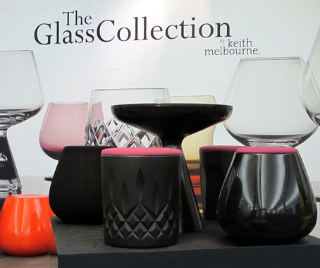
Zenith's Thursday night VIP party. This was a great start to the Saturday Indesign adventure. 'The highlight' I hear you all ask? Meeting Keith Melbourne the designer of the exquisitely designed 'Glass' collection.

Chatting with Keith Melbourne

The wonderful Belinda from Zenith Brisbane

'Glass' by Keith Melbourne

Keith Melbourne

'Glass' by Keith Melbourne

I woke to a beautiful Saturday morning, perfect SiD weather. Corporate Culture was the first stop as I was keen to check out the launch of their 'About A Chair' by Hee Welling for Hay. 

Also pictured are my favourite lights, Caravaggio for Lighyears.


Favn by Jaime Hayon


These chairs are stunning and comfortable. Definitely on my wish list!

It was then over to Stylecraft....


A big 'Thank you' to Natalie in the Brisbane showroom for sending me a very handy Wallpaper Guide to Sydney....


Then finishing up at Jardan, one of my favourite showrooms....


To sum up, an amazing day with amazing products and amazing people. Already, planning a trip to Melbourne for next years Saturday Indesign.